Hey everyone, Yale here.
I’ve been working with our user interface (UI) team for quite some time now and we thought it might be a good time to talk a little about what we are doing right now.
Early last year we decided to take a new approach. We would continue working on the current UI and implement the most needed features, fixes etc, but at the same time start from scratch on a new UI. This new UI should take all the lessons we learned from the last couple of iterations and apply them in it. Of course this splits up our already tight resources even more and often feels as if we are riding two trucks at the same time.
The topics we want to focus on in this blog post are the following:
- Mod-ability
- Performance
- Visual redesign
Mod-ability
One of the goals was to avoid pain points like the single file for app layouts, which required us to overwrite players’ own layouts, when we needed to make a change. So in every new system we are writing now, we are considering how and if this could be modded. This makes designing systems a lot harder and more time consuming, but it also means it will be super easy to add and modify them. Additionally, we found that designing that way includes thinking on how to scale the UI and forces thinking about problems that typically would have been an afterthought otherwise.
One example is the menu system of the new UI, which handles how new menus are picked up, integrated into the UI and finally displayed.
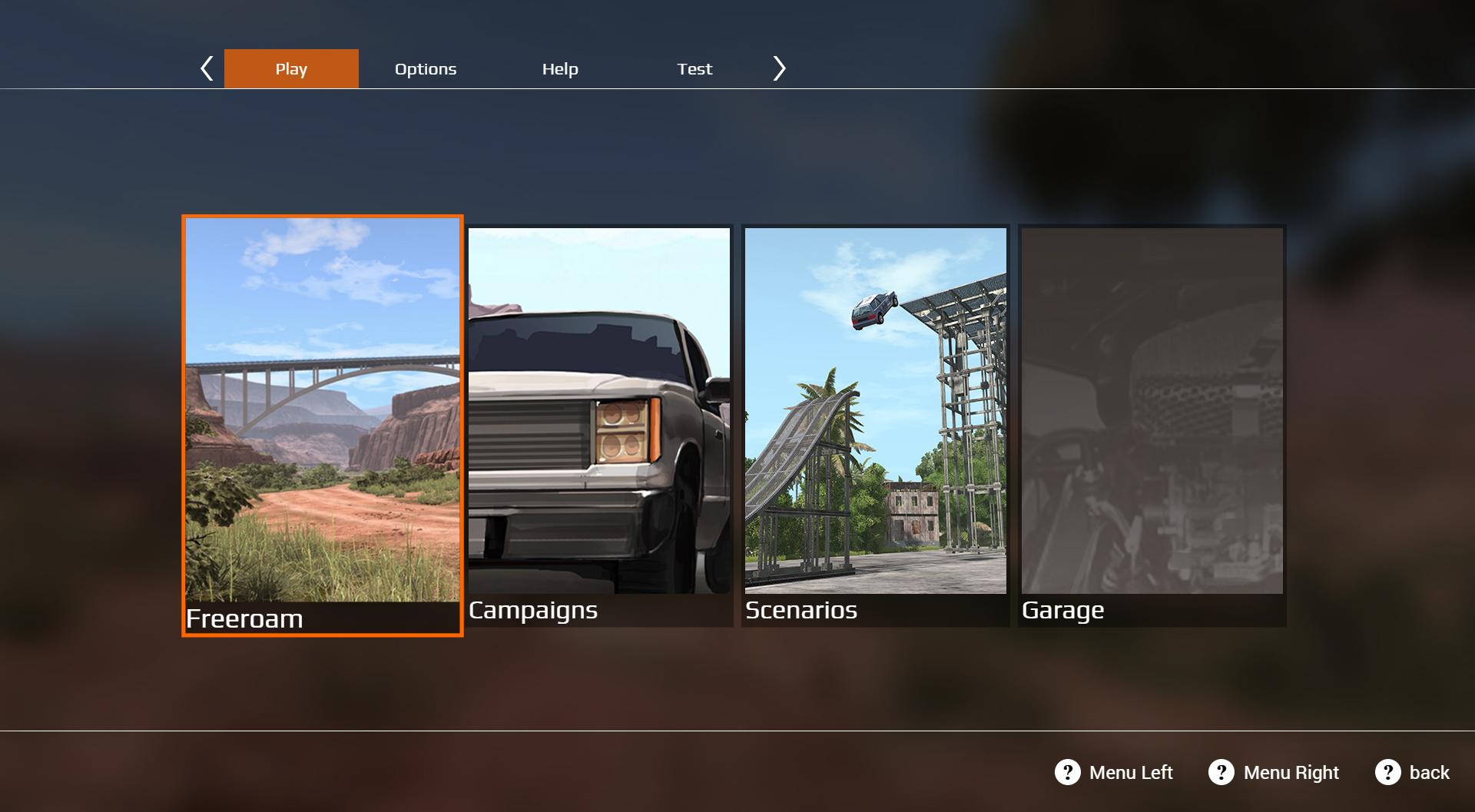
The menus up top (Play, Options, Help etc) are stand-alone folders, as are the menus in the middle (Freeroam, Campaigns etc). Remove a folder and the only difference is the missing menu in game. Add one and you get a new entry.
Performance
A valuable lesson from the current UI is where and when to expect bottlenecks. Of course we cannot predict all performance issues, but it does help a lot and we are keeping this in mind when working on the new systems. As much as we’d like to port all improvements back to the current UI, that is not possible, due to the fact that most systems are incompatible to each other.
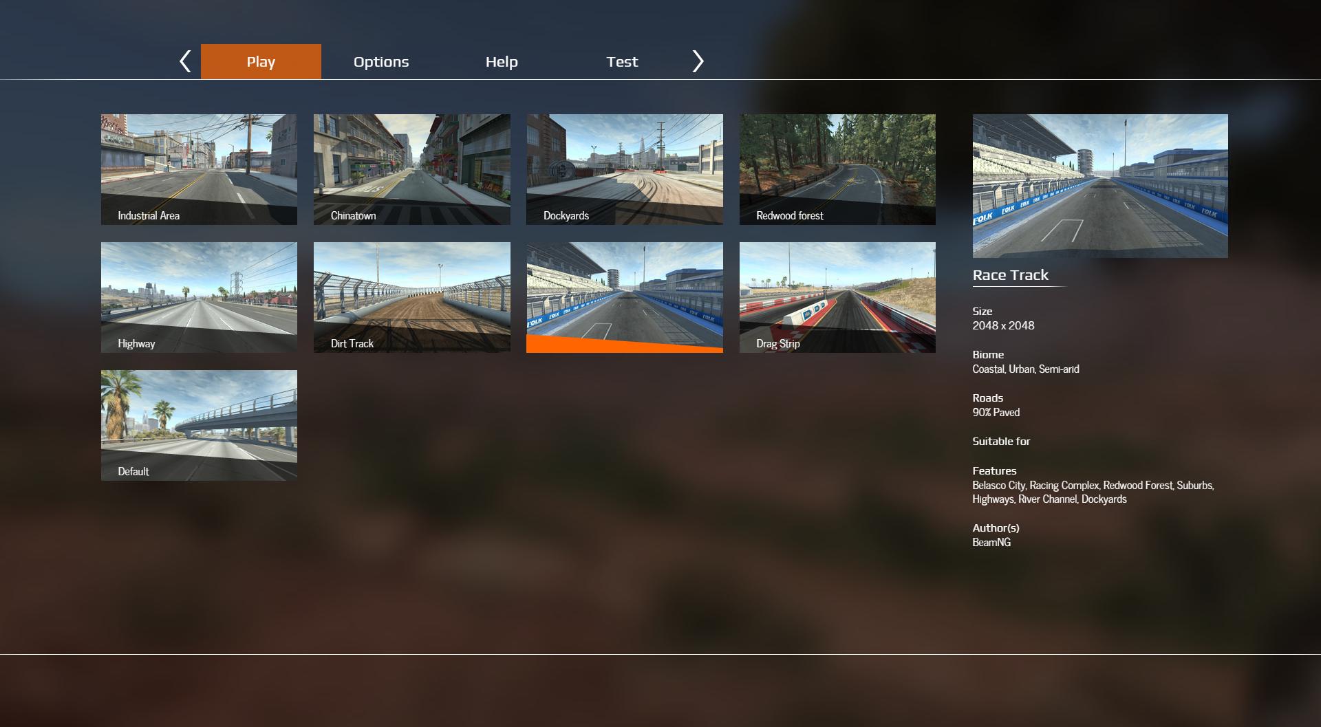
One thing that made it back though and that probably shows the improved performance most visibly, is the vehicle selector grid. We used a technique called a virtual scroll, which essentially only loads the content it needs to display, instead of every single image in the list. While the concept is nothing new, we use this and similar techniques in all bottle necked menus for the new UI and are observing a more fluent and responsive UI overall.
Let’s have a look at how this is noticeable.
First there is scrolling performance. This is where we are lucky with CEF (the render software of our UI), which seems to optimize for small scrolls even with huge lists. However, you can see the problems when jumping a long section. Note how the optimized grid is faster, but also how you can actually see when it loads new images. This happens due to the scrolling being faster than it can load the needed images.
Equally noticeable is the responsiveness of the single elements due to the decreased cpu and memory load.
Both videos are recorded using a mouse recorder and with roughly 250 mods enabled.This is one very visible performance issue and of course we have heard problems like slow or freezing UIs and are working on those.
Visual redesign
As you already have seen, we removed the Material Design System in favor of our own, more gamey design. The material / android themed look didn’t bother us last time we revamped our UI, but the more BeamNG.drive became a game, the more the UI felt out of place. This was already getting obvious when we designed the garage and the mission screens.
We decided to take a very close look at general patterns that would fit the amount of menus and options we have. As well as feeling more gamey, being fast and easy to use and understand, while not restricting speed of use or being exclusively for keyboard or gamepad (to name just a few points on our wishlist for a perfect UI). These often are conflicting, but nonetheless important points to consider. Of course nothing is perfect and we needed to make a lot of trade-offs, but we then distilled all of that into something that felt suitable as UI of BeamNG.drive and that you can see as prototype in the attached images.
Approach
The first step to the new UI was to identify the core problems, pain points and lessons we’ve learned over the years, but also writing down and discussing all the new and exciting features we wanted to implement.
The current UI started to reach its limits some time ago. It was hard to find places for new menus, features and so on. Not only on screen, but also implementation wise. Additionally, there were some design choices that made a lot of sense then, but didn’t scale well over time, like for instance the app layouts, as mentioned above.
Originally we planned to keep most of the code in the current UI, adapt and revise it for the new one, since that would be a lot faster than a full re-write. However, it pretty soon became obvious that this would not address all the problems we wanted to solve. So we went forward only keeping a handful of the libraries and went for a full re-write of the UI.
Okay, but when can I try it?
There is a lot of stuff we need to finish before we can release this UI. We learned quite some things from the garage in that regard. So we’ll need to ask you to be patient. We are working on it as fast as we can, but need to split up a lot of resources to maintain and update the necessary parts of the current UI as well as internal prototypes etc.
Once public, you will be able to switch between the two UIs. That way you will be able to check out the new UI without missing features, until the new UI is feature complete.
We are looking forward to releasing the first prototype and getting a lot of feedback from all of you!
I hope this gave you a brief insight on what we are up to. Until the next time,
Yale
TL;DR
We are working on a brand new UI, that is designed from the ground up with performance and mod-ability in mind and additionally will feel more like a game UI. The following is a short dip into discussions and decisions made. It will be released when ready.